Northeast Generator branding — Case Study
Industry: Backup power · Standby generators · Energy services
Region: New England & Tri‑State (US)
Engagement: Rebrand (identity, print, web)
Client Website: northeastgenerator.com
The brief
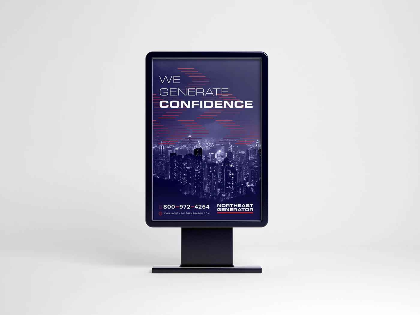
There’s a moment in every company’s life when rebranding becomes necessary. That’s when Northeast Generator brought Qubed Agency on board to refresh the brand. The positioning hinged on one clear promise: “WE GENERATE CONFIDENCE.” Our task was to design an energetic, cohesive identity system that carries this message across print, web and field applications.
Strategy
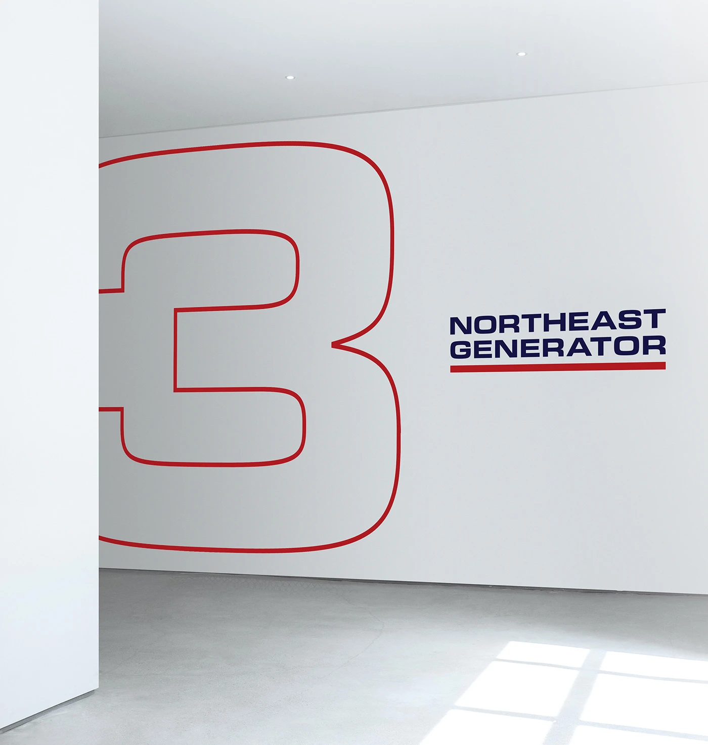
We translated the promise into a visual language built on three pillars: reliability, readiness, and clarity. A dynamic diagonal energy bar motif becomes the through‑line across materials, signaling motion and uptime. High‑contrast typography and a disciplined grid ensure the brand holds up from service vans to mobile UI.
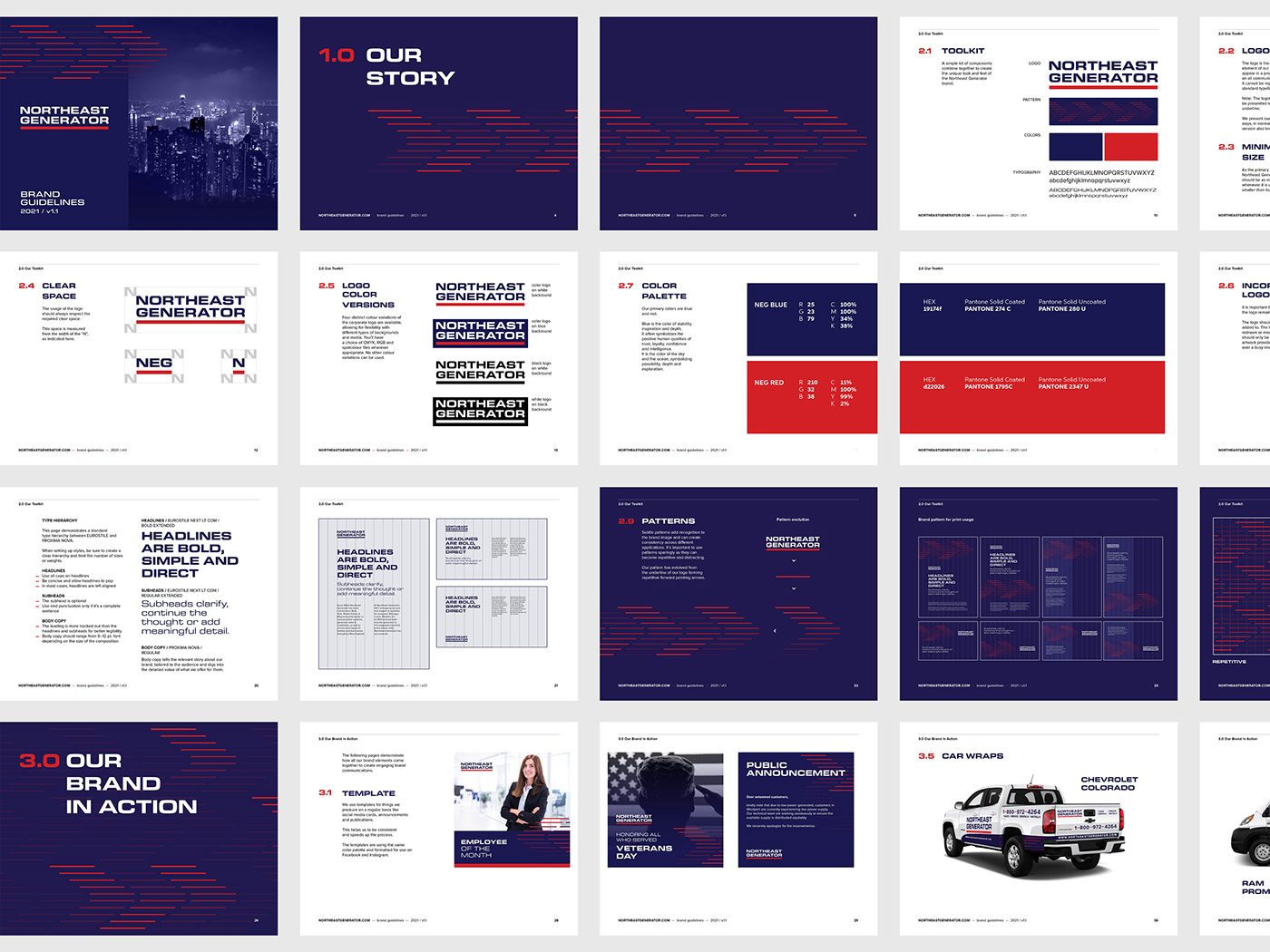
Identity system
- Logo & wordmark: refined geometry for legibility on fleet livery, uniforms and small UI.
- Tagline lockups: “We Generate Confidence” lockups for long and compact placements.
- Color: safety‑aware palette (slate base, electric accent) with WCAG‑AA text contrast.
- Iconography: simplified power, service and maintenance pictograms for signage and web.
Print & field collateral
Business cards and letterheads share a consistent margin system; service forms, proposal covers and job‑site notices apply the energy bar for instant recognition. Fleet and apparel guidelines specify logo placement, reflective ink options and minimum sizes for DOT‑compliant visibility.
Web & digital
We supplied hero modules, CTA banners and a component kit (cards, comparison tables, “book a service” panel) so the in‑house team can roll out pages quickly while keeping consistency. The motif scales elegantly from desktop to mobile without obscuring copy.
Rollout & governance
A concise brand guide documents clear space, color builds, typography scales, and do/don’t examples. Vendor specs (print, embroidery, vehicle vinyl) reduce friction and keep Northeast Generator branding consistent across partners.
Results & impact
- Stronger message discipline around “We Generate Confidence.”
- Faster asset production with reusable templates for print and web.
- Cohesive look across identity, field collateral and digital touchpoints.