Case study /

Rebranding a Health Discovery Platform – Neuronytics

Explore How a Rebrand Helped a health discovery platform in the Health Industry

Rebranding a Health Discovery Platform – Neuronytics

Overview

Qubed Agency is a branding and web design agency providing high quality services in the fields of technology, machine learning, marketing, crowdfunding and other technology related businesses. With a team of cross-sectional experts, the Qubed Agency has been changing the dynamics of the Branding world.

Client: Neuronytics

Neuronytics is an absolute technology-based marketplace. People and organizations can easily collect and trade neuro biomarker data. Neuronytics make sure that anonymity is key for every user who gets onboard with them.

What we did:

We rebranded the Neuronytics. From designing the website from scratch to making a new logo, we at Qubed Agency made sure that Neuronytics emerges as a new brand. From designing the logo, stationary, expo booth design, website, whitepaper, to charts/infographics, Qubed Agency worked days and nights to give the brand a new image and identity with more focus on Client orientation.

Rebranding a Health Discovery Platform – Neuronytics

Logo

This interactive and innovative logo is a depiction of the healthcare services that Neuronytics provide. Our logo designers have used symbols of neurons to make the logo as relevant as possible with Neuronytics. By presenting multiple concepts using the sign of a neuron, Qubed Agency made sure the logo represents the true soul of the company.

Old Logo

Rebranding a Health Discovery Platform – Neuronytics

New Logo proposals

Rebranding a Health Discovery Platform – Neuronytics

Visual branding

Neuronytics will be an absolute technology-based marketplace. From trading neuro biomarker data to unique games, the website will be an absolute treat. Qubed Agency’s main strategy is to make the website more user-friendly. From increasing user engagement to fulfilling the efficacy needs. The UI/UX is made more interactive and digital. All the features are made easily approachable.

Rebranding a Health Discovery Platform – Neuronytics

UX & UI design

Qubed Agency made the UI design more mobile friendly. The UI is more user-focused and responsive. With a transparent UI, the interaction of the users is made more feasible.

NEW DESIGN OLD DESIGN

Neuronytics branding — UI dashboard components
Rebranding a Health Discovery Platform – Neuronytics

Whitepaper design

Scroll through the Whitepaper of Neuronytics to know what services they are offering.

Neuronytics branding — expo booth backdrop
Rebranding a Health Discovery Platform – Neuronytics

Impact on branding

Qubed Agency made Neuronytics a unique digital health tracking system by providing the rebranding in the right manner. From designing the new logo to making stationary, expo booth design, website, whitepaper, and charts/infographics, Qubed Agency did it all.

Rebranding a Health Discovery Platform – Neuronytics

Stationery Design

Neuronytics branding — stationery set

From making neuro biomarkers mainstream by allowing the users to interact with Neuronytics digitally, Qubed Agency made the stationery design more professional, user friendly and helpful. Apart from that, a touch of professionalism and uniqueness was added to Neuronytics.

Neuronytics branding — stationery set
Rebranding a Health Discovery Platform – Neuronytics

Neuronytics branding — Case Study

Industry: Digital health · Neuro‑biomarkers
Region: Global
Engagement: Brand identity, UI/UX web design, print & event collateral
Client website: Neuronitics

Overview

Neuronytics is positioned as a technology‑driven platform focused on neuro‑biomarker data and preventive healthcare. Our task was to deliver a Neuronytics branding program that modernizes the brand, improves clarity for partners, and creates a consistent system across product UI, website and printed assets.

Objectives

  • Establish a distinctive visual identity that evokes science, trust and clarity.
  • Build a scalable design system for website UI, dashboards and marketing pages.
  • Create print & event materials (stationery, expo booth) to support launches and partnerships.
  • Produce a whitepaper design and data‑led graphics to explain the platform’s value.

Strategy

We anchored Neuronytics branding on three pillars: Evidence, Empathy, Efficiency. The visual language combines a rational grid with human‑centric spacing and type scales. A neuron‑inspired monogram and modular UI components give the team speed without losing brand recognition.

Logo & symbol

  • A refined neuron‑network monogram works from 16px favicons to large‑format booth graphics.
  • Wordmark engineered for legibility on light/dark modes and print finishes.
  • Clear‑space, minimum size and misuse rules included in the brand book to protect Neuronytics branding assets.

Color & typography

  • Core palette: deep indigo, electric cyan, soft slate; WCAG AA contrast maintained on core components.
  • Type pairing: geometric sans for headings, humanist sans for UI labels and body copy; optical sizing for small UI.

UI/UX web design

We rebuilt the site with a component‑driven system—cards, data blocks, step flows and pricing/plan modules—to explain complex ideas simply. The Neuronytics branding elements (color, monogram, data lines) guide wayfinding without visual noise.
Highlights: mobile‑first layout, accessible forms, performance budgets, and image sprites for icon sets.

Whitepaper & data graphics

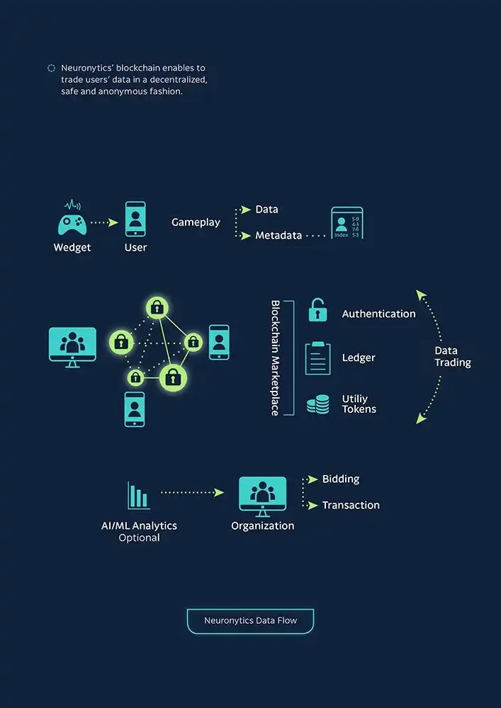
We created a whitepaper layout and a micro‑library of charts/infographics (pipelines, privacy model, marketplace flows). Each graphic uses the Neuronytics branding palette and grid to stay consistent across slides, PDFs and web.

Print & expo collateral

Stationery (business cards, letterhead, folders), expo booth backdrops and roll‑ups follow the same grid, with spot UV/foil options for premium runs. Vendor specs and dielines are included for frictionless production.

Results & impact

  • Clearer product story and partner‑ready visuals.
  • Faster content production with reusable UI components and brand templates.
  • Consistency across Neuronytics branding touchpoints—from app to booth.

Interested in results like this? Talk to us →
Explore our related services: Brand Identity, Logo Design, Web Design

START A PROJECT

Like what you see?

before you go...

can we help you
with anything?