Like what you see? Contact Us.

In the universe of web design we have been experiencing a very long procedure of incorporating font type effects in sites, which previously was technically impossible, or at least could only be supported by a few browsers. Fortunately this situation has changed in the last couple years and we are now in 2020 enjoying an explosion of creativity in the use of web typography and communication.
The beginning of the new decade is going to split right down the middle when it comes to font trends.
On the right side, we’ll see the modern sans serif fonts that have dominated the digital space continue to grow. On the left side, bright-coloured and expressive ‘character’ fonts will be become more popular with designers and brands alike.

Image: myfonts.com
Goldplay is based on Isidora Sans design yet features rounded shapes. It’s soft, rounded and this is one of the friendliest font with expressive look. Exelent choice for headlines, logotypes, branding, motion graphics and magazines. Contains a set of 540 characters that support over 200 Latin-based language.

Image: medium.com
Every single glyph of Helvetica has been redrawn and redesigned for this expansive new edition – which preserves the typeface’s Swiss mantra of clarity, simplicity and neutrality, while updating it for the demands of contemporary design and branding.
Helvetica Now comprises 48 fonts, consisting of three distinct optical sizes: Micro, Text and Display. Each one has been carefully tailored to the demands of its size.

Image: myfonts.com
Jazmín is inspired by “Globe Gothic” design yet features different proportions, curves, serif shapes and contrast, which give it a classy, playful and a more contemporary look. The family comes in two versions: an elegant font of 8 weights-ranging from Thin to Black-with matching italics, and an alternate, more playful counterpart with the same number of weights and italics.

Image: weandthecolor.com
Olivetta—an ironic sans. Olivetta illustrates the power of words as images. The high contrast between thick and thin strokes of the lowercase letterforms gives visual strength to the font. The stroke contrast increases as the weights get heavier.

Image: fontreviewjournal.com
“Untitled Sans is a neo-grotesque typeface released through Klim Type Foundry in 2017. It was purposefully designed to look like a “quotidian, common-looking typeface” with no discerning characteristics. The family is available in five weights with matching italics. There is also a companion serif version, Untitled Serif, which isn’t visually related to Untitled Sans but shares the same “common-looking” concept.”

image: myfonts.com
Malou Verlomme designed Madera with graphic designers in mind – drawing on his decade of experience designing bespoke type to create a versatile, easy-to- use geometric sans serif that ticks off a long list of branding requirements. Its sharp apexes add some flavour to the design, which offers an honest, trustworthy tone of voice – but with a twist. “The design doesn’t go out of its way to attract attention, but is still very solid,” explains Verlomme. “It still has a fair amount of warmth and personality, in a very understated manner. If you’re a large corporation, with a typeface being used in many different environments, you want something that’s easy to use but can sustain such a large amount of visibility.”

image: myfonts.net
Breton is a geometric slab serif typeface inspired by Boston. Breton has a strong personality and it is an ideal face for headings and branding design. Its most noticeable characteristic is a great difference of proportions between rounded characters (like “o”, “c” or “e”) and non-rounded ones (like “n”, “m” or “z”). By combining them, you will be able to give your compositions a very unique rhythm.

image: myfonts.net
A unicase typeface inspired by Latin American wrestling. Versus is a type system designed for use with short and block text. The font, based on well-known typefaces found on boxing posters, combines Latin American elements and wrestling; it is this mixture of widths and weights and different styles which helps give your designs a unique flavour and personality.

image: dafont.com
Just like Grandma’s recipe, Recoleta combines a variety of ingredients—from various popular 1970s typefaces—such as the soft and gentle shapes found in Cooper or the fluid, angled strokes in Windsor— mixed into one single design that features familiar, yet fresh, modern flavors.
Its variety of weights provide a range of choices that will help you find the best typographic color for your project. Lighter weights are well-suited for body text while heavier ones are ideal for high impact headlines. The available stylistic alternates offer a number of different characters that give your logo or business card a unique look.

image: ifonts.xyz
Trust Sans is a friendly typeface, with a flowing ductus and humanist features, specially created to help designers face everyday challenges. This font comes in a variety of weights—perfectly suited to establishing an effective typographic hierarchy—and contains an extensive character set, including small caps, different figure styles, case-sensitive forms, contextual and discretionary ligatures, etc. The family glyph set supports over 200 Latin-based languages.
Like what you see? Contact Us.
Sources:
https://www.myfonts.com/fonts/latinotype-mexico/trust-sans/
https://www.myfonts.com/fonts/latinotype/recoleta/
https://www.myfonts.com/fonts/latinotype/versus/
https://www.myfonts.com/fonts/latinotype/breton/
https://www.myfonts.com/fonts/mti/madera/
https://www.myfonts.com/fonts/los-andes/olivetta/
https://www.myfonts.com/fonts/latinotype/jazmin/
https://www.myfonts.com/fonts/mti/helvetica-now/
https://www.myfonts.com/fonts/latinotype/goldplay/
https://www.typewolf.com/site-of-the-day/fonts/untitled-sans

The cost of building an eCommerce website varies based on several factors, like the size of the business, the complexity of the website, the features

Your company’s brand is the way it is perceived by customers, clients, and the general public. It is how they see you, what they think

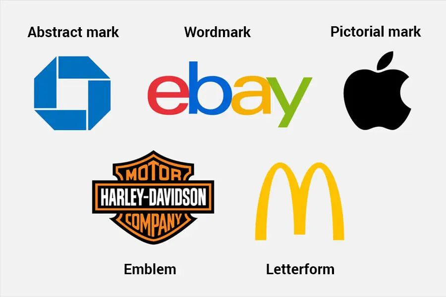
There are many different types of logos – a logo might be just a name set in a chosen typeface or a mark or both.

WordPress has revolutionized how we build and share online content. At Qubed Agency, we explore how this open-source platform changed the internet — and why
| Cookie | Duration | Description |
|---|---|---|
| cookielawinfo-checkbox-analytics | 11 months | This cookie is set by GDPR Cookie Consent plugin. The cookie is used to store the user consent for the cookies in the category "Analytics". |
| cookielawinfo-checkbox-functional | 11 months | The cookie is set by GDPR cookie consent to record the user consent for the cookies in the category "Functional". |
| cookielawinfo-checkbox-necessary | 11 months | This cookie is set by GDPR Cookie Consent plugin. The cookies is used to store the user consent for the cookies in the category "Necessary". |
| cookielawinfo-checkbox-others | 11 months | This cookie is set by GDPR Cookie Consent plugin. The cookie is used to store the user consent for the cookies in the category "Other. |
| cookielawinfo-checkbox-performance | 11 months | This cookie is set by GDPR Cookie Consent plugin. The cookie is used to store the user consent for the cookies in the category "Performance". |
| viewed_cookie_policy | 11 months | The cookie is set by the GDPR Cookie Consent plugin and is used to store whether or not user has consented to the use of cookies. It does not store any personal data. |